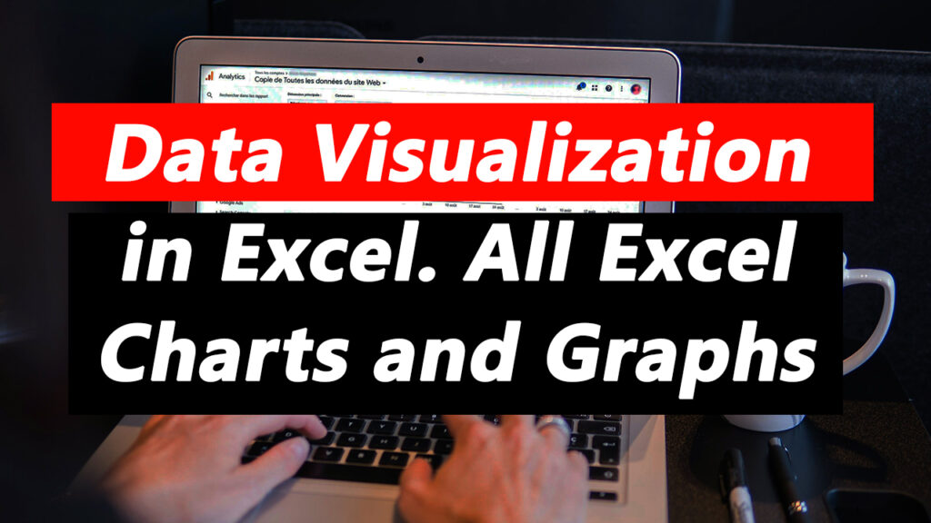
In today’s data-driven world, the ability to communicate insights effectively is paramount. Data visualization serves as a powerful tool for transforming raw data into actionable insights, enabling decision-makers to gain valuable perspectives and make informed choices. Among the myriad of data visualization tools available, Microsoft Excel stands out as a versatile and widely-used platform for creating a wide range of charts and graphs. In this blog post, we’ll explore the significance of data visualization in Excel and delve into the myriad of charts and graphs it offers.
Why Data Visualization Matters
Data visualization transcends the realm of numbers and statistics, offering a visually compelling way to convey complex information. Here’s why data visualization is indispensable:
- Clarity and Understanding: Visual representations of data facilitate clearer understanding and comprehension, allowing stakeholders to grasp insights quickly and intuitively.
- Insight Discovery: Data visualization uncovers patterns, trends, and relationships within datasets that may otherwise remain hidden in tabular form, enabling deeper insights and informed decision-making.
- Communication: Visualizations serve as a universal language that transcends barriers of language and technical expertise, enabling effective communication of insights to diverse audiences.
- Actionable Insights: Well-designed visualizations empower decision-makers to identify opportunities, spot anomalies, and address challenges proactively, driving organizational success.
Excel: A Versatile Platform for Data Visualization
Microsoft Excel, ubiquitous in offices and businesses worldwide, offers a robust set of tools for creating compelling charts and graphs. From simple bar charts to intricate heatmaps, Excel empowers users to visualize data in diverse formats, catering to various analytical needs.
Here’s why Excel is an ideal platform for data visualization:
- Accessibility: Excel is readily available and familiar to millions of users, making it accessible to a wide audience without the need for specialized software or training.
- Integration: Excel seamlessly integrates with other Microsoft Office applications, enabling users to incorporate visualizations into reports, presentations, and dashboards effortlessly.
- Versatility: Excel offers a diverse array of chart types, including column charts, line charts, pie charts, scatter plots, histograms, and more, catering to a wide range of data visualization requirements.
- Customization: Excel provides extensive customization options, allowing users to fine-tune chart elements, colors, labels, and formatting to suit their preferences and requirements.
Exploring Excel Charts and Graphs
Excel offers a plethora of charts and graphs, each suited to specific data types and analytical objectives. Here’s an overview of some popular Excel charts and graphs:
- Column Chart: Ideal for comparing data across categories, such as sales performance by region or product category.
- Line Chart: Effective for visualizing trends and patterns over time, such as stock prices or sales trends.
- Pie Chart: Useful for illustrating proportions and percentages, such as market share or distribution of expenses.
- Scatter Plot: Perfect for identifying relationships and correlations between two variables, such as sales revenue vs. advertising expenditure.
- Bar Chart: Similar to column charts but with horizontal bars, suitable for comparing data across categories in a horizontal layout.
- Histogram: Ideal for visualizing the distribution and frequency of data within a dataset, such as exam scores or customer age groups.
- Heatmap: Useful for displaying matrix data as a grid of colored cells, allowing users to identify patterns and anomalies at a glance.
Conclusion
Data visualization in Excel offers a powerful means of transforming raw data into meaningful insights that drive informed decision-making. With its versatility, accessibility, and extensive range of charts and graphs, Excel empowers users to create compelling visualizations that convey complex information effectively.
Whether you’re a business analyst, financial planner, researcher, or student, mastering data visualization in Excel is a valuable skill that enhances your ability to analyze data, communicate insights, and drive organizational success.
In subsequent blog posts, we’ll explore in-depth tutorials and best practices for creating specific types of charts and graphs in Excel, providing you with the knowledge and tools needed to unlock the full potential of data visualization in Excel. Stay tuned for more insights and practical tips on harnessing the power of Excel for data visualization.